Case study: how the Max Cam Scanner app icon was made with Vector Studio
From a few overlapping shapes to a five-region SVG and launcher icons, using the same Vector Studio that runs on this site.
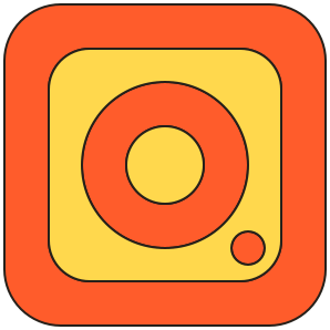
When Max Cam Scanner needed an icon, we did not open a design suite. We used Vector Studio, the same free tool that runs on this site. This is how a handful of overlapping shapes became the app icon on Google Play, and what it shows about drawing icons that stay readable at 48 pixels.
The brief
- Say “camera” and “document” at once. A scanner app icon should read as a camera, but a calm, squared one, like a page.
- Use the brand tokens only. Orange
#ff5c2b, yellow#ffd84d, and ink#26201afor outlines, the same colours as the app and this website. - Flat and bold. No gradients, no glass, no fine detail that disappears on a phone home screen.
Step 1: five shapes
The whole icon is built from five simple shapes on the Vector Studio canvas:
- An outer square, 290 × 290 units, with large rounded corners: the camera body.
- An inner square, 210 × 210, centred inside it, also rounded: the panel.
- A circle 150 units across: the lens ring.
- A smaller circle, 70 across, in the middle of it: the lens.
- A 30-unit dot overlapping the lower right of the lens ring: the shutter light, which also keeps the icon from looking perfectly symmetric.
Every size is a round number, which is easiest to get by typing into the precise draw fields instead of dragging. Rounded corners like these come from the Round Corner control. Keeping the frame a constant 40 units thick is what makes it read as one solid body at small sizes.
Step 2: fill the regions, not the shapes
This is where Vector Studio differs from drawing filled shapes on top of each other. Overlapping outlines divide the canvas into enclosed regions, and the Fill tool colours a region, the space between lines, directly. In the icon there are five:
| Region | Fill |
|---|---|
| Frame between the outer and inner squares | Orange |
| Ring between the two lens circles | Orange |
| Shutter dot | Orange |
| Panel inside the inner square, outside the lens | Yellow |
| Lens centre | Yellow |
Because each region is its own closed path with a hole cut out (the SVG uses the even-odd fill rule), there is no hidden shape stacked under another. That makes the file honest: what you see is exactly what is there, which matters when the icon is later cut into launcher layers.
Step 3: export the selection
Export selection as SVG crops the file to the selected artwork plus its outline, which is why the icon's view box is 298 × 298: the 290-unit body plus a small margin for the ink outline. The canvas around it is not included.
Curves are written as many short straight segments, 68 points for each rounded square and up to 128 for a circle. At icon sizes the segments are far smaller than a pixel, and the format is simple for any tool to read. The whole SVG is under 12 KB.
Step 4: from SVG to app icon
- Hard shadow, added in the app. The app's logo puts a blur-free black offset shadow behind the icon, the same hard shadow used on every card and button. It is a style applied when drawing, so the SVG itself stays flat.
- Wordmark. Next to the icon: MAX CAM in bold Space Grotesk and a small yellow Scanner chip in JetBrains Mono. This website uses the same pattern: MAX Q with a Studio chip.
- Launcher icons on cream. Android adaptive icons, the legacy icon, iOS, and the 512 × 512 Google Play icon all place the artwork on the app's cream background (
#fff4dd), so it matches the splash screen.
Lessons for your own icon
- Test small, early. Look at every variant at 24 and 48 pixels before judging it at full size. Details that vanish there are not worth keeping.
- Type numbers, do not eyeball. Even widths and centred circles look intentional; one unit off looks like a mistake.
- Two fill colours are enough. Orange for structure, yellow for the inside. The ink outline does the rest.
- Keep the source editable. Saving a Vector Studio project means the next variant starts from the real shapes, not from a flattened PNG.
Try it: open Vector Studio, draw a rounded square and a circle that overlap, and use Fill on the regions they create. It runs in your browser and nothing is uploaded.