One drawing, two logos: how the maxq.tools and maxqstudio.dev marks were made in Vector Studio
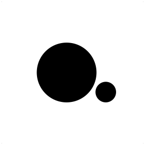
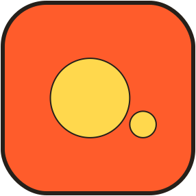
A square, a circle, and a dot one third its size. The same Vector Studio drawing became the black-and-white studio mark and the orange maxq.tools logo.
Max-Q Studio has two homes on the web: maxqstudio.dev, the studio's own site, and maxq.tools, the free tools you are using now. Their logos look different at first glance, one black and white, one orange and yellow. They are the same drawing. Both were made in Vector Studio, the editor on this site, and saved as Vector Studio project files.
Three shapes
Open both exported SVG files and the geometry is identical, down to the third decimal:
| Shape | Size in canvas units | Role |
|---|---|---|
| Square | 278 × 278 | The frame, and the app-icon tile on maxq.tools |
| Circle | radius 57.9 | The “O”: a lens, a dot of focus, the Q without its tail |
| Dot | radius 19.3, exactly one third of the circle | The full stop: “done” |
The relationships are deliberate, and they are what make the mark feel balanced. The dot is one third the size of the circle. It sits to the lower right, its centre 77.2 units to the right of the circle's centre, which is the two radii added together, and 38.6 units lower, two of its own radii. So it almost touches the circle, with a small gap of air that keeps the two shapes separate even at favicon size.
Vector Studio's precise position and size fields make proportions like these easy to hit exactly, instead of nudging shapes by eye. Because both projects use the same values, the two logos line up perfectly when placed side by side.
Two colourways
- maxqstudio.dev: black shapes on white. The studio site is quiet and monochrome, so the mark is too.
- maxq.tools: the square is filled orange (
#ff5c2b), the circle and dot yellow (#ffd84d), with the ink outline (#26201a) used across the site and the Max Cam Scanner app. On the site the square gets rounded corners, like an app icon.
Vector Studio's Fill tool colours the regions between outlines. The square minus the two circles is one region; each circle is another. That is why recolouring the mark is a matter of filling three regions, not redrawing anything.
From project file to logo
- Save Project keeps an editable Vector Studio file, so the shapes, not a flat picture, are the source of truth.
- Export selection as SVG crops the file to the artwork. Both exports have the same 286-unit view box.
- For maxq.tools, the SVG is clipped to a rounded square and rendered as the favicon, the Apple touch icon, and the header logo. The share image uses the same file.
Why one drawing for both
A small studio does not need two unrelated logos. Using one drawing in two colourways says that the tools and the studio belong together, while each site keeps its own mood. It also means one source file to maintain: change the proportions once, export twice.
Try it: open Vector Studio, draw a square, a circle, and a circle a third of its size, type in exact positions, and fill the regions. That is the whole logo. For a more detailed icon, read how the Max Cam Scanner icon was made.